People often ask designers to just "make it look pretty." I agree – first impressions matter. But I’ve learned that good design goes much deeper. It’s about understanding who you’re talking to, what they care about, and how to communicate in a way that really clicks. For me, that means knowing the rules – but also knowing how (and when) to break them. The best design doesn’t just look good, it works!
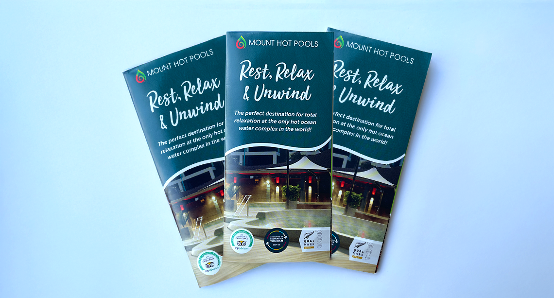
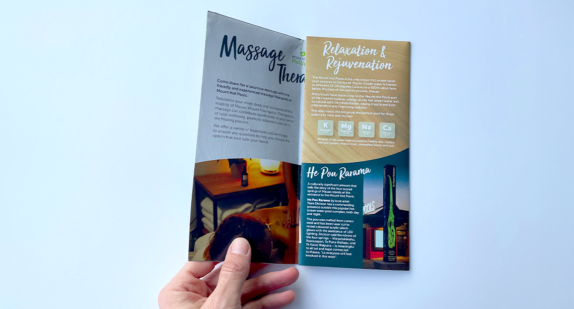
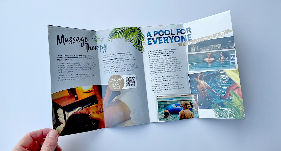
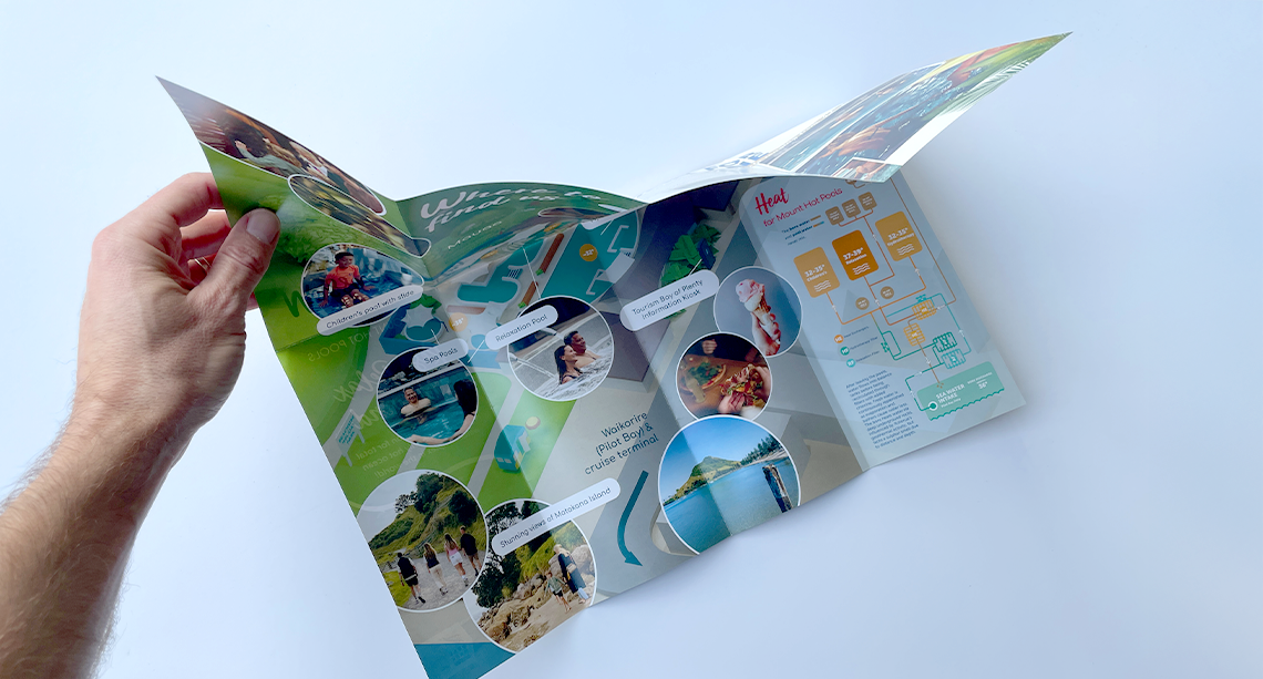
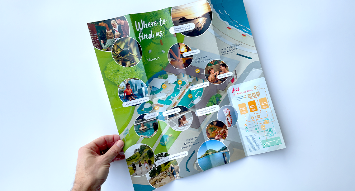
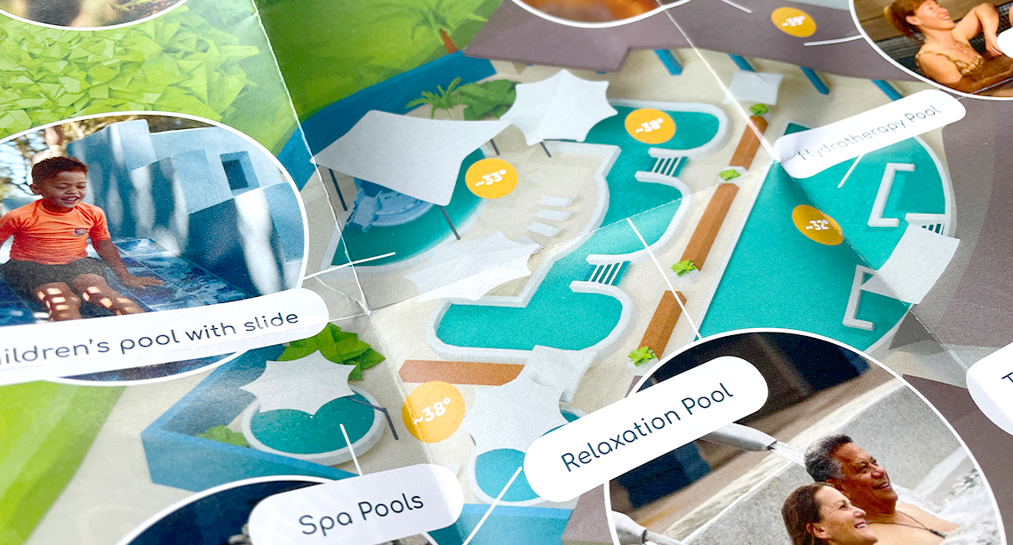
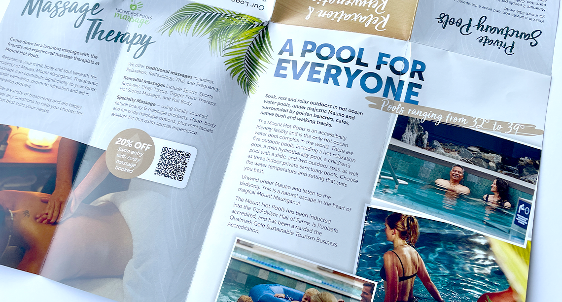
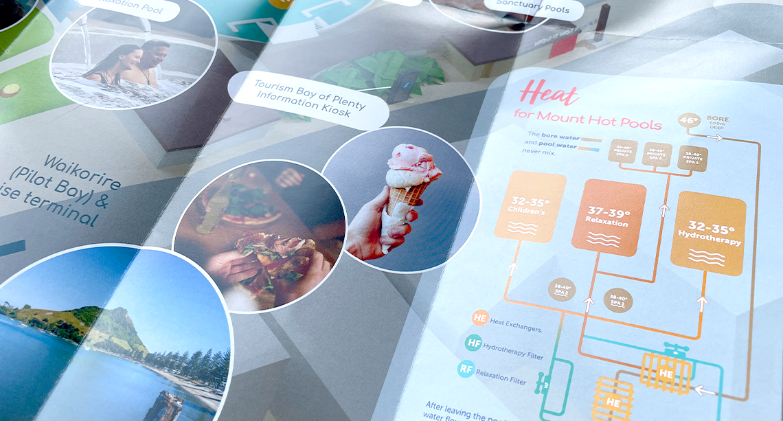
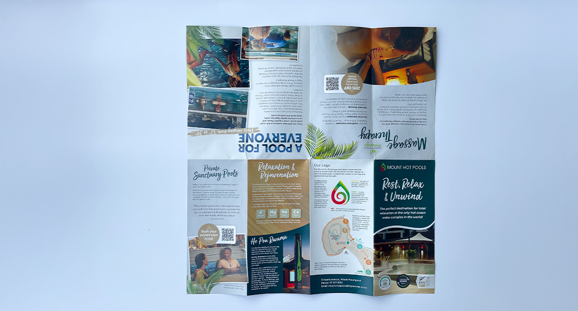
The Mount Hot Pools are a Bay of Plenty icon – and one of my personal favourites. I designed this brochure to help visitors explore the pools and nearby attractions. The reverse side features a detailed scale 3D illustration of the complex that I created to bring the layout to life.
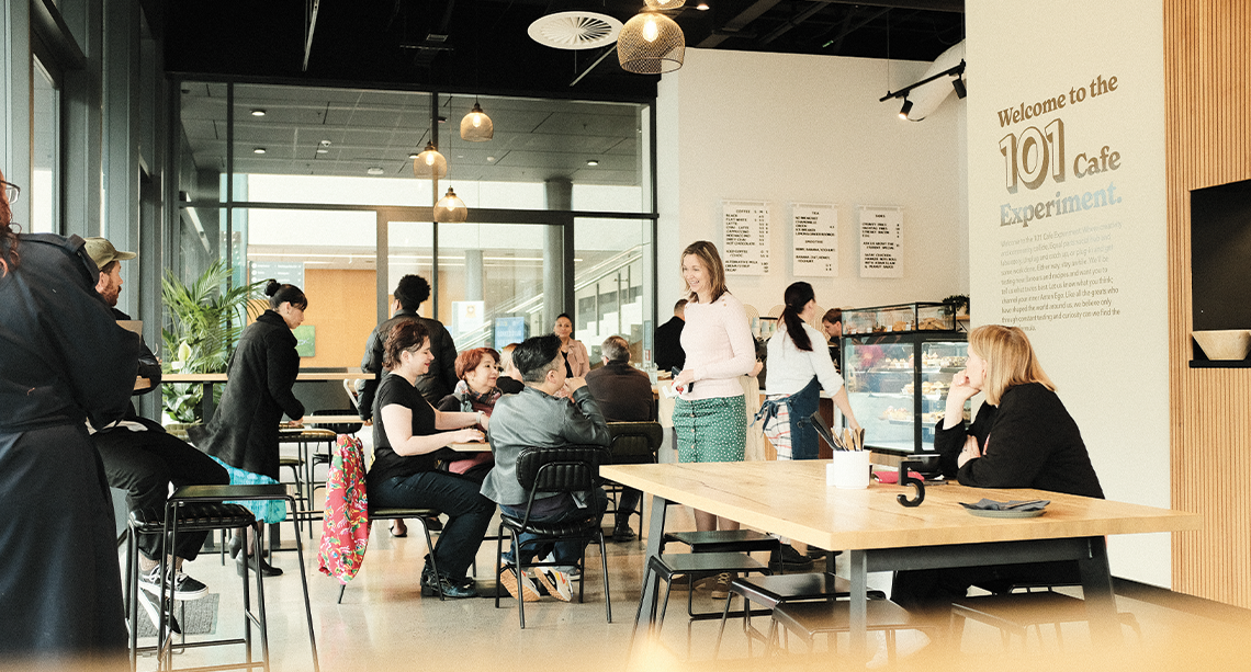
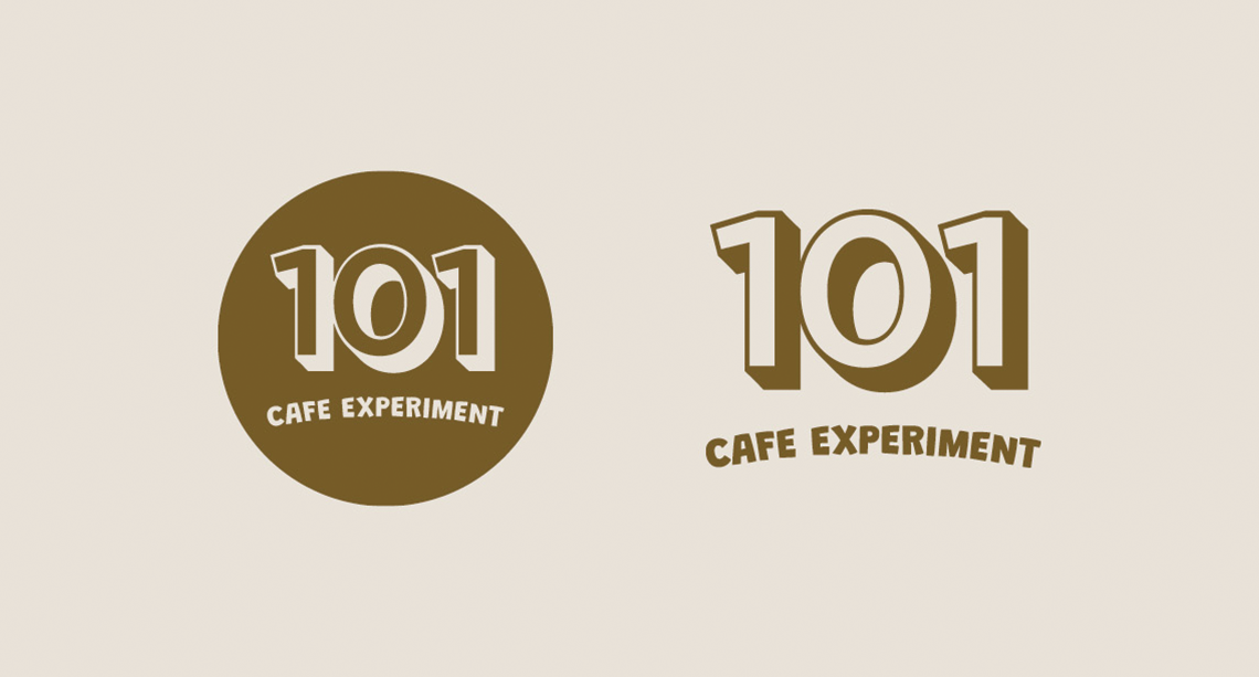
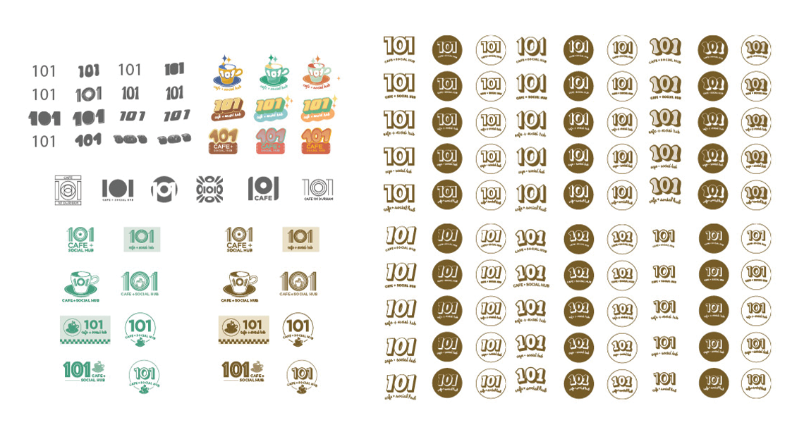
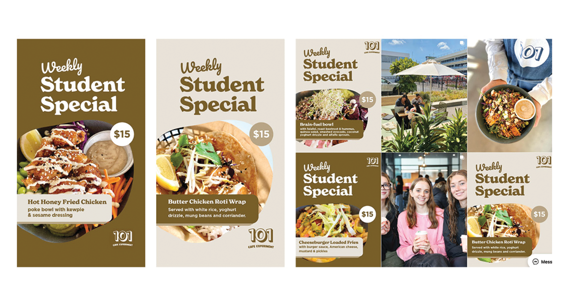
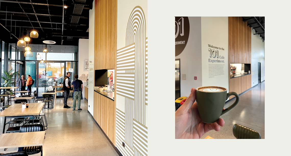
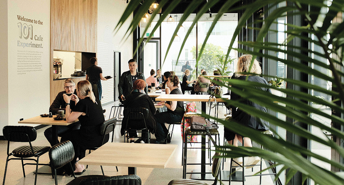
The 101 brand is built on the idea of going back to basics — doing the fundamentals right and creating a solid foundation.
Inspired by its name, 101 speaks to both the address (101 Durham St) and the spirit of ‘first things first’— like starting the day with a good coffee!
The use of colour and repeat patterns taps into ‘modern nostalgia’, tying together the playful, authentic, and socially connected vibe of a vibrant campus community.
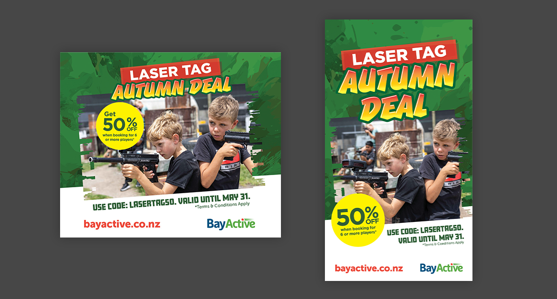
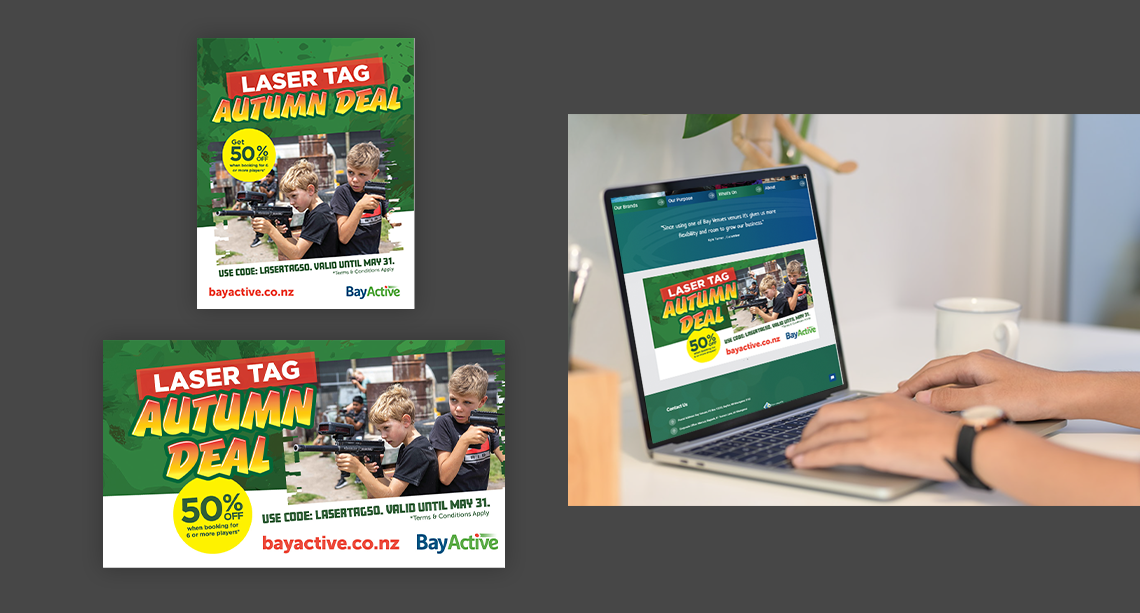
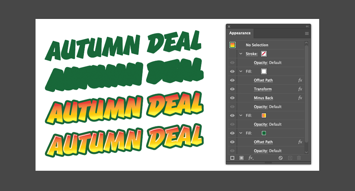
I had a lot of fun refreshing the promo look and feel of this seasonal BayActive Laser Tag promo. This involved creating a custom font effect in Adobe Illustrator that is fully editable, and a camo-inspired background graphic to reflect the combative (yet playful) feel of laser tag.
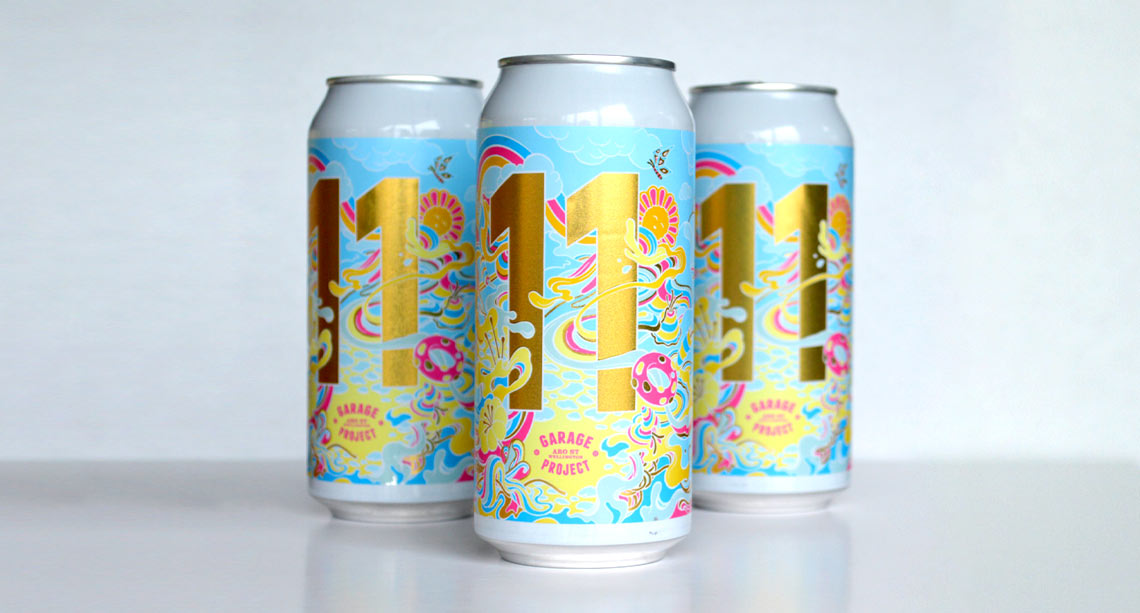
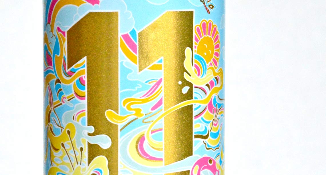
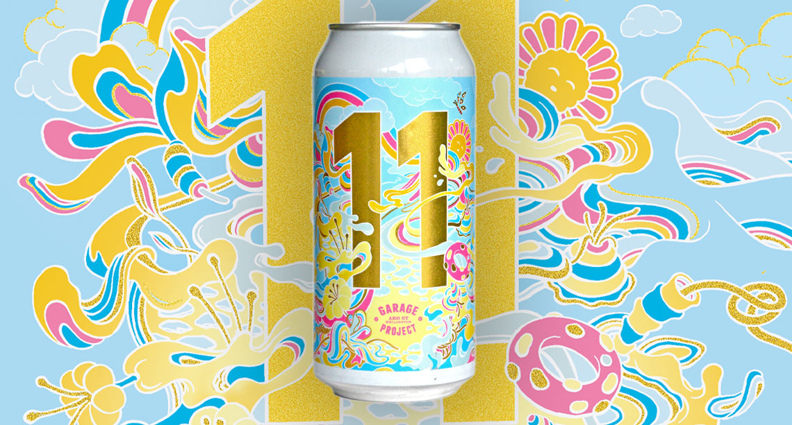
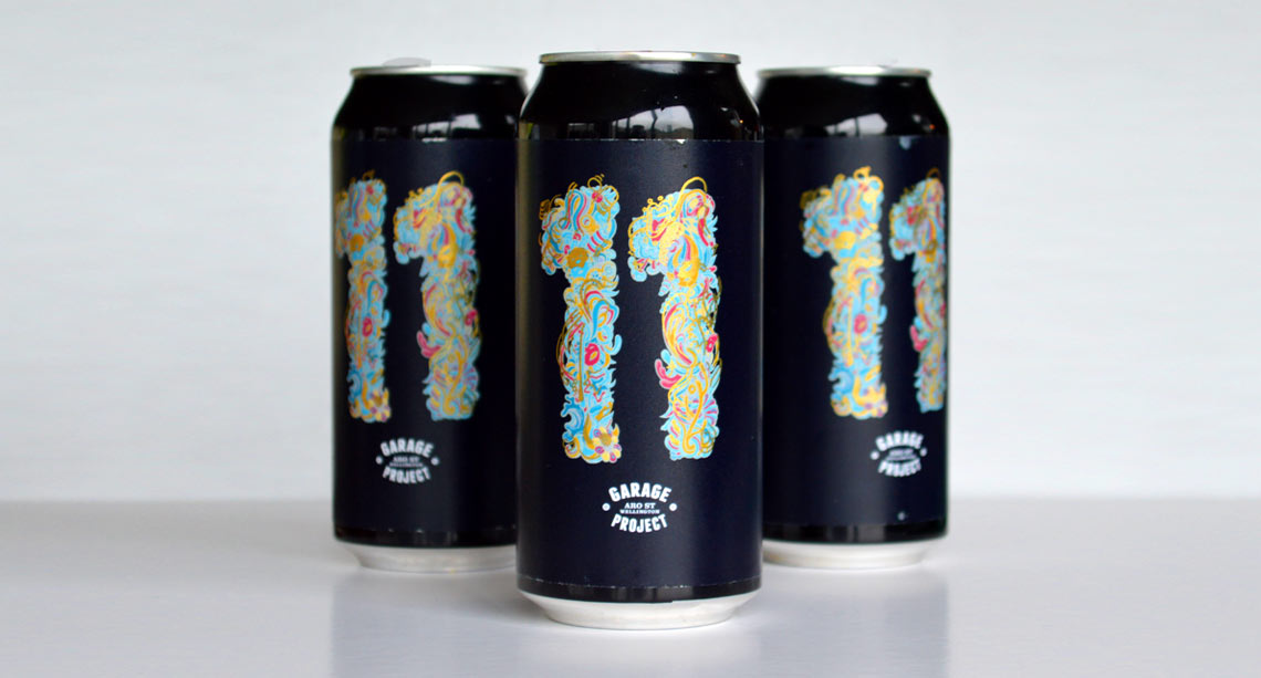
I had a ball creating this can artwork for the Garage Project 11 Year Anniversary. For this design I blended bold color, fluid forms, and surreal energy to create something eye-catching, and a little offbeat.
The Garage Project team are always great to work with, and I love the way they promote and respect their contributing artists.
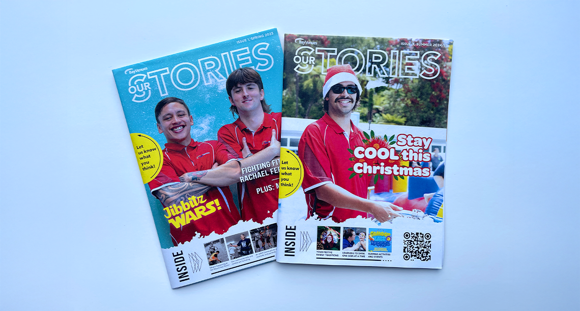
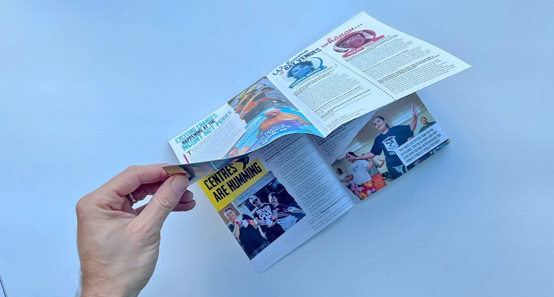
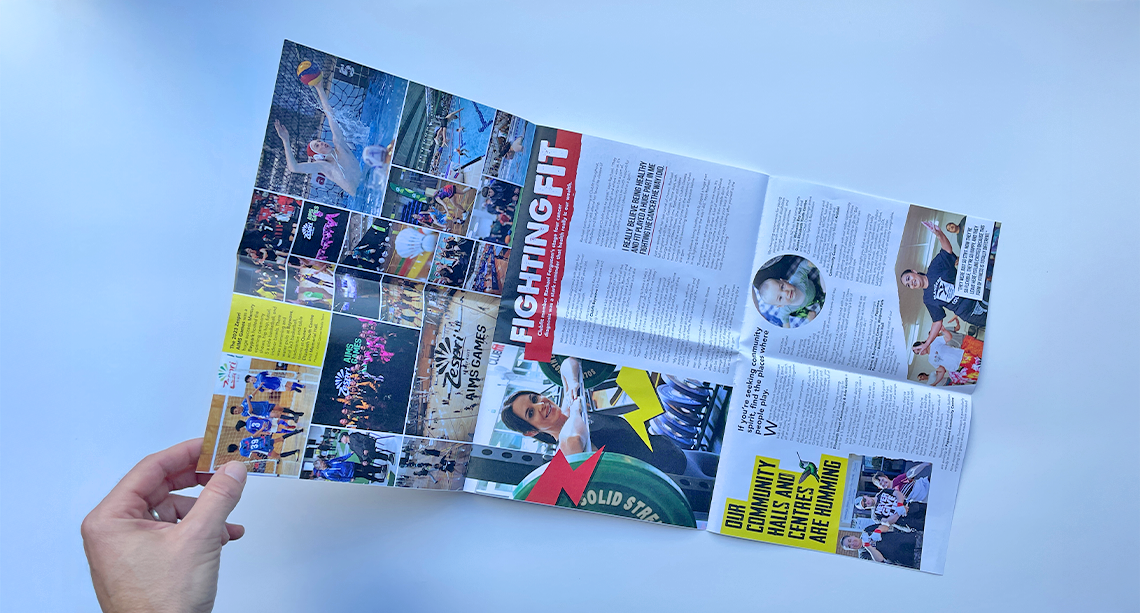
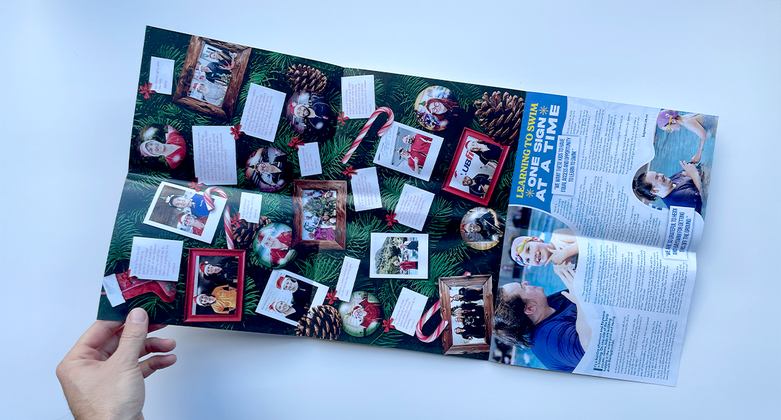
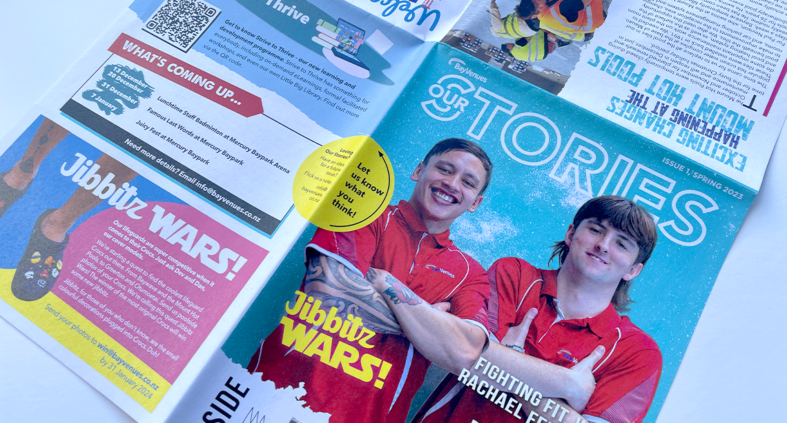
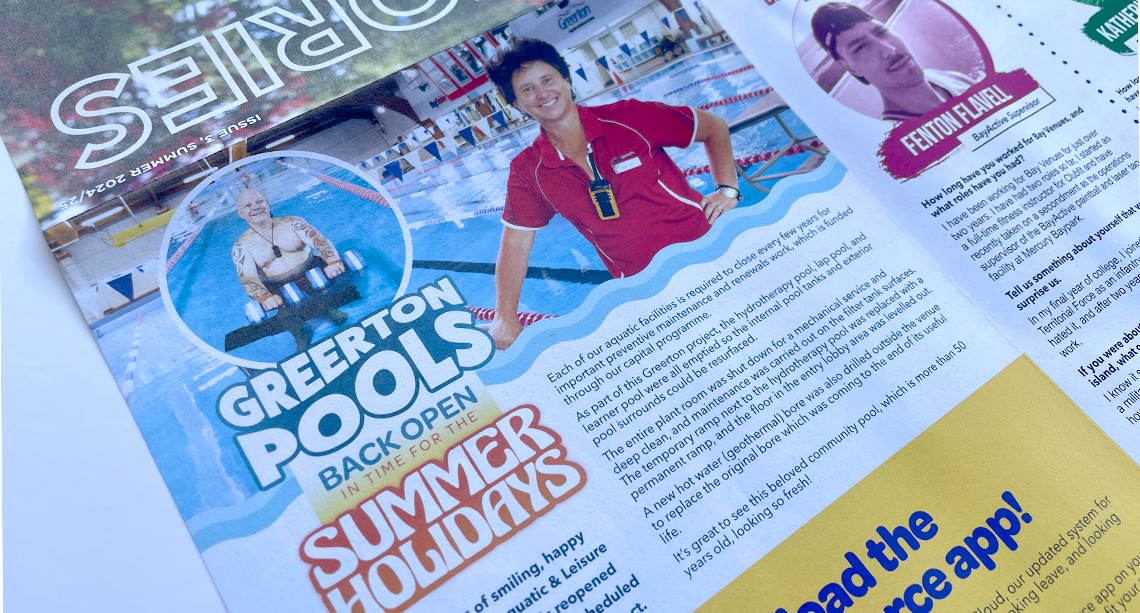
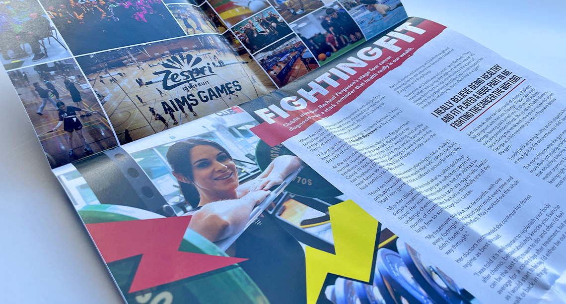
In my role as Senior Graphic Designer at Bay Venues, I get to work on a range of engaging projects—including this staff magazine. This publication showcases key stories from across the organisation and celebrates successes, often highlighting the contributions of those working behind the scenes.
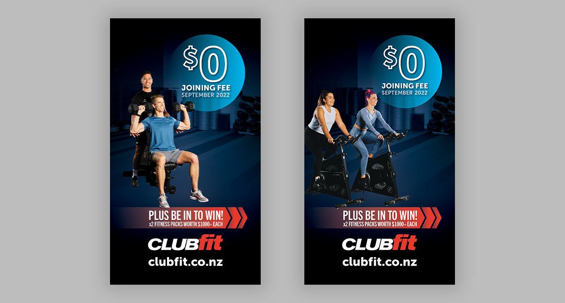
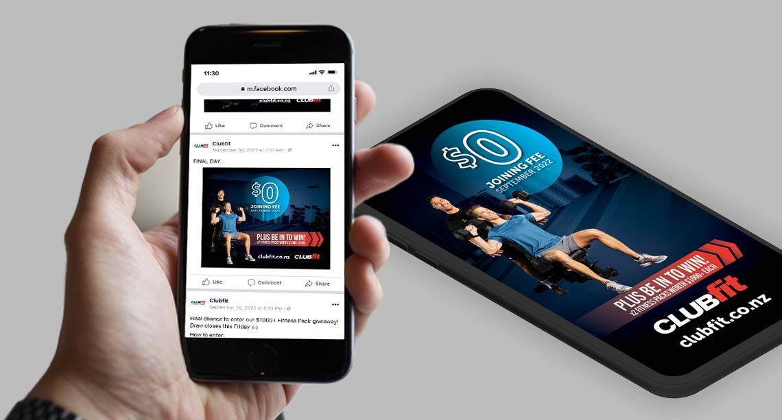
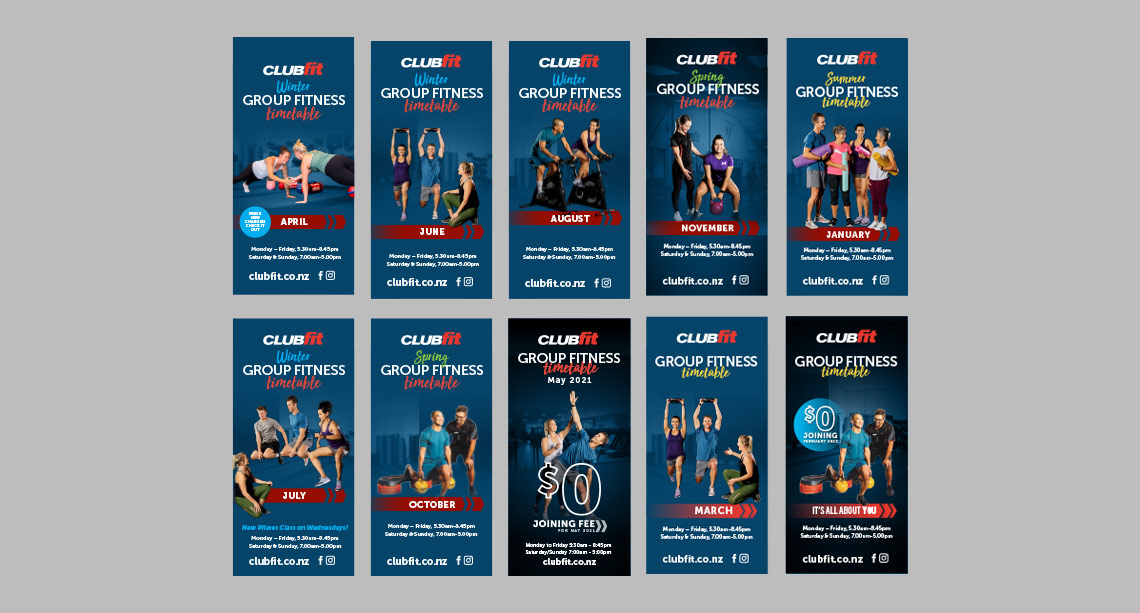
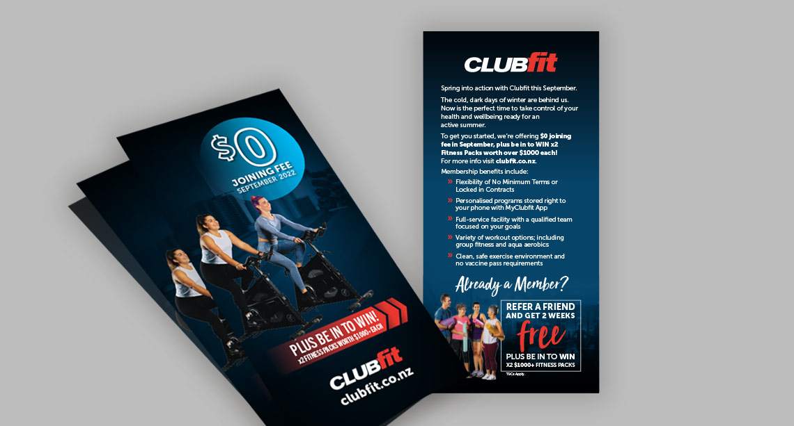
In my current design role I get to work on some really fun projects, such as this refresh of the Clubfit gym promotional material. This initially involved fleshing out the look and feel with stakeholders, helping plan the photoshoot and a lot of clear cutting! The design was extended to a recent update of the UI design on the Clubfit website, and continues to evolve today.
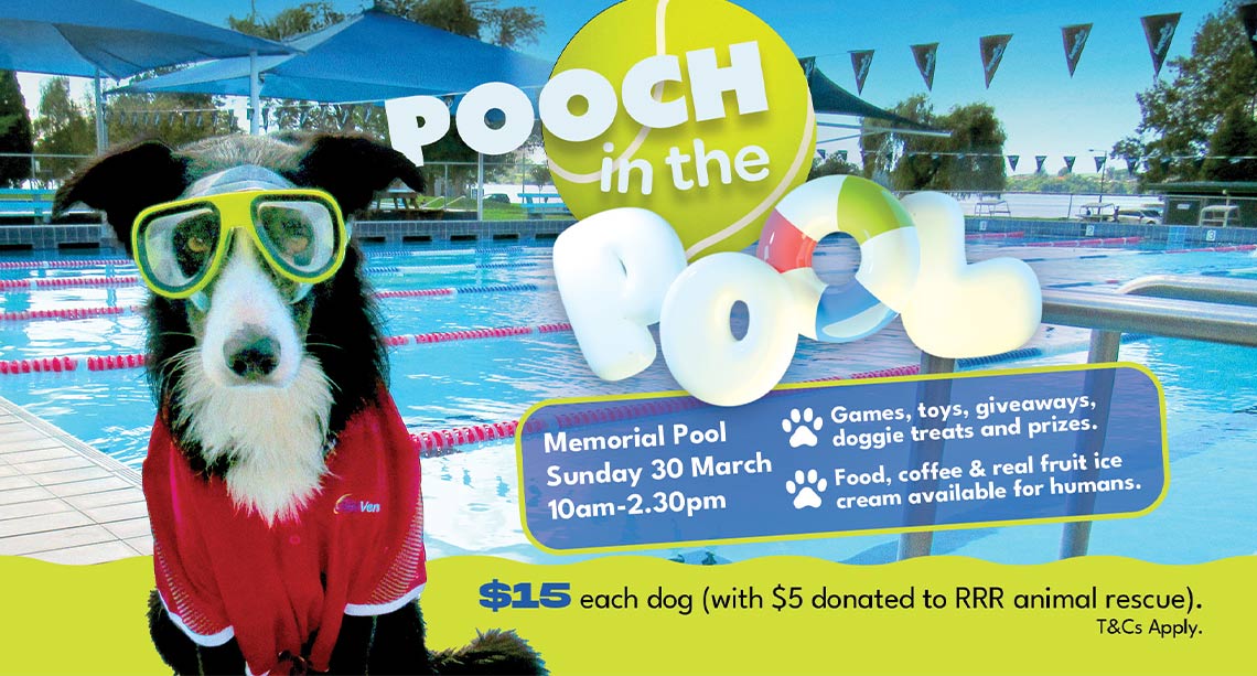
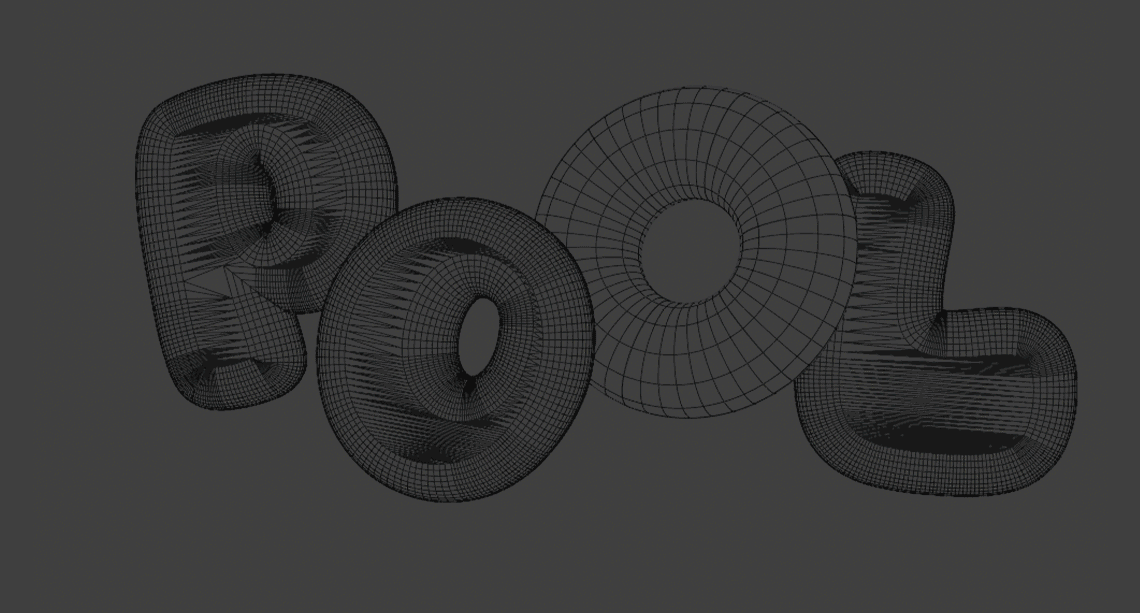
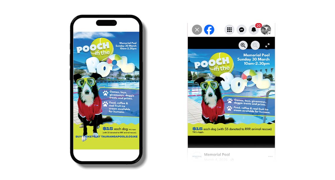
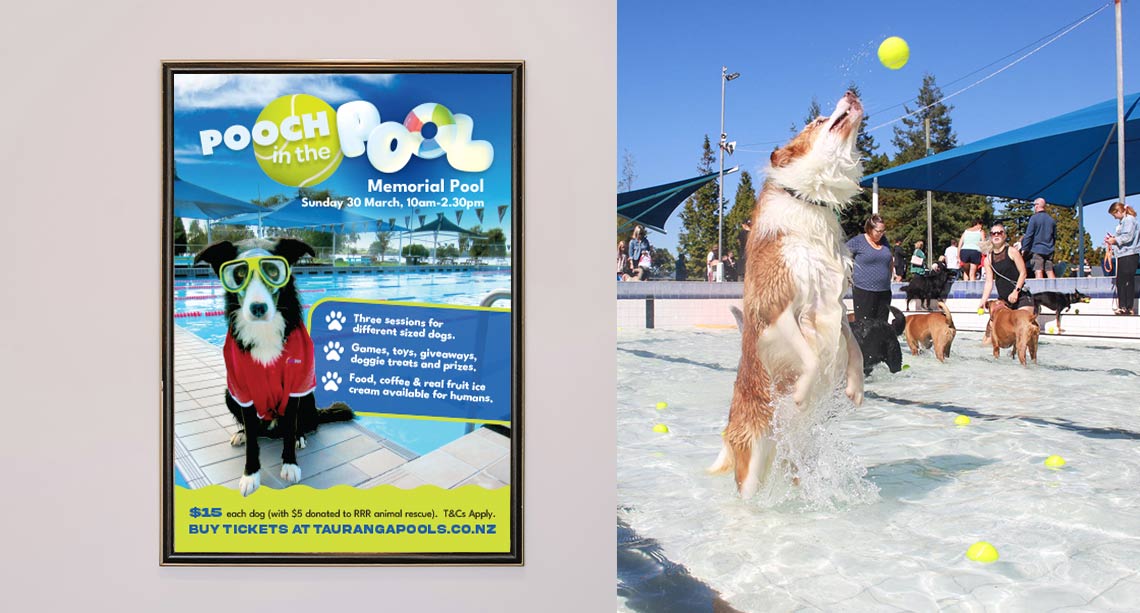
Pooch in the Pool is a family and canine friendly event that celebrates the closure of Memorial pool for the winter, with a pool party for the pooches! I had a great time working on the design and layout for this promo, including the creation of some fun custom 3D type.
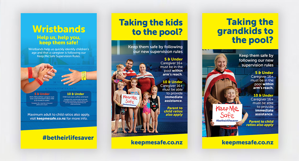
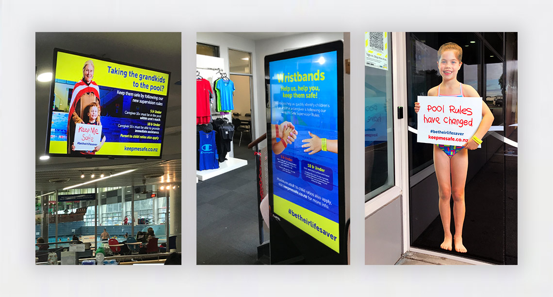
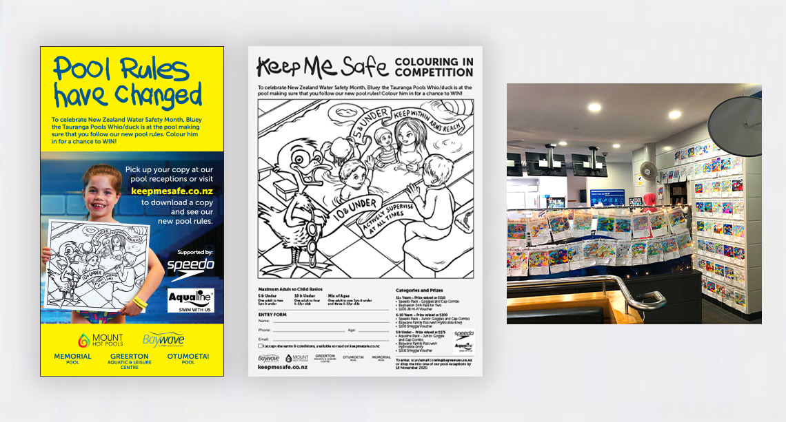
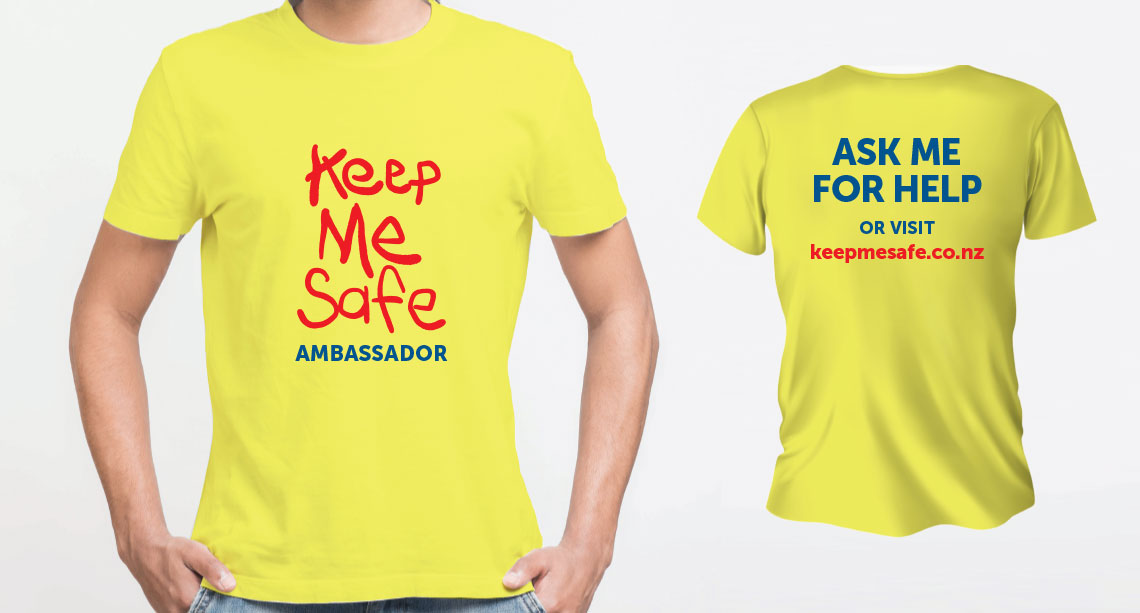
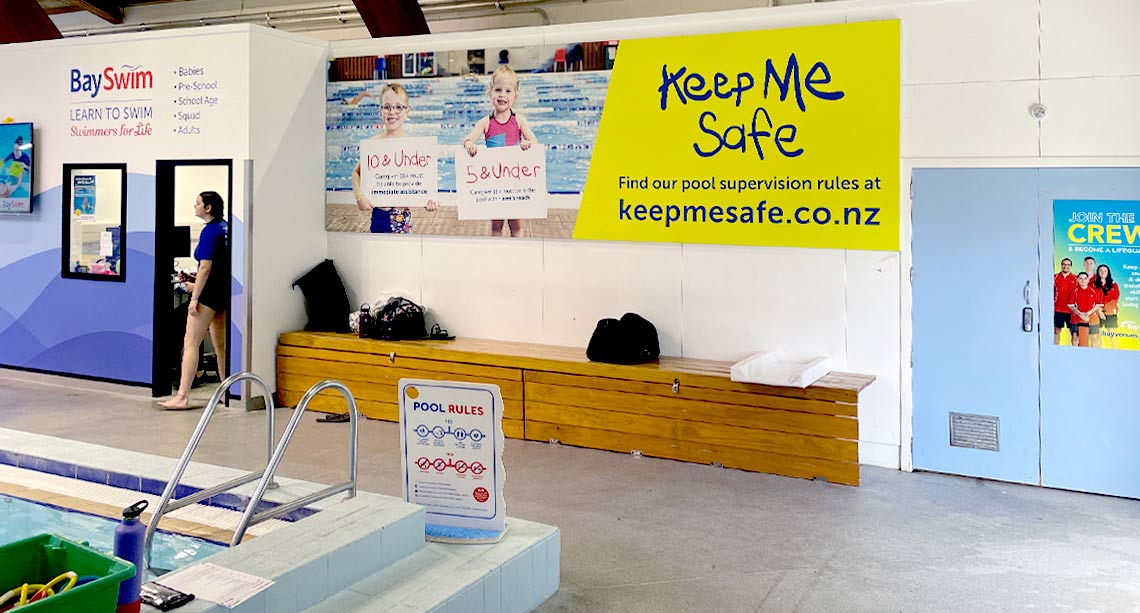
I learned a heap working on the design material for this award-winning campaign while working at Bay Venues. This campaign received the Aquatic Innovation Award at the 2021 Recreation Aotearoa Aquatics Awards. It was an extensive campaign involving digital for social media, print, website, t-shirt printing, life-sized corflute cutouts around the pools, and a colouring competition! I was also involved in helping direct the photoshoot and on-site installations.
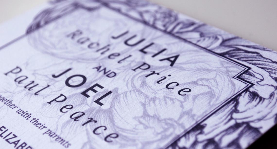
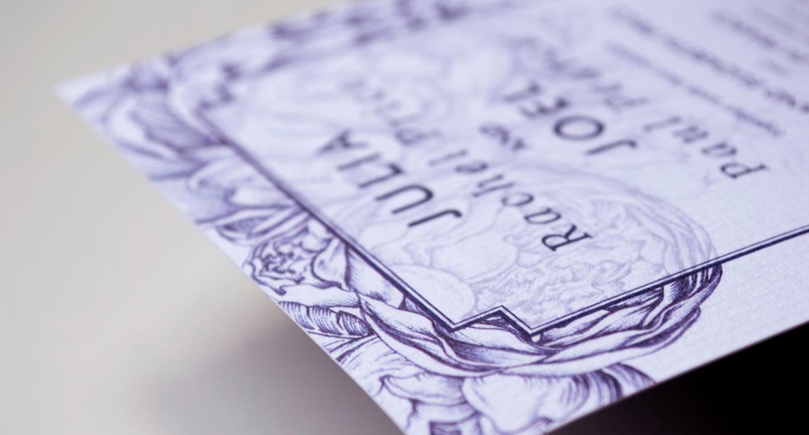
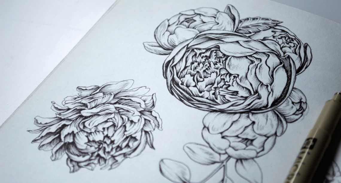
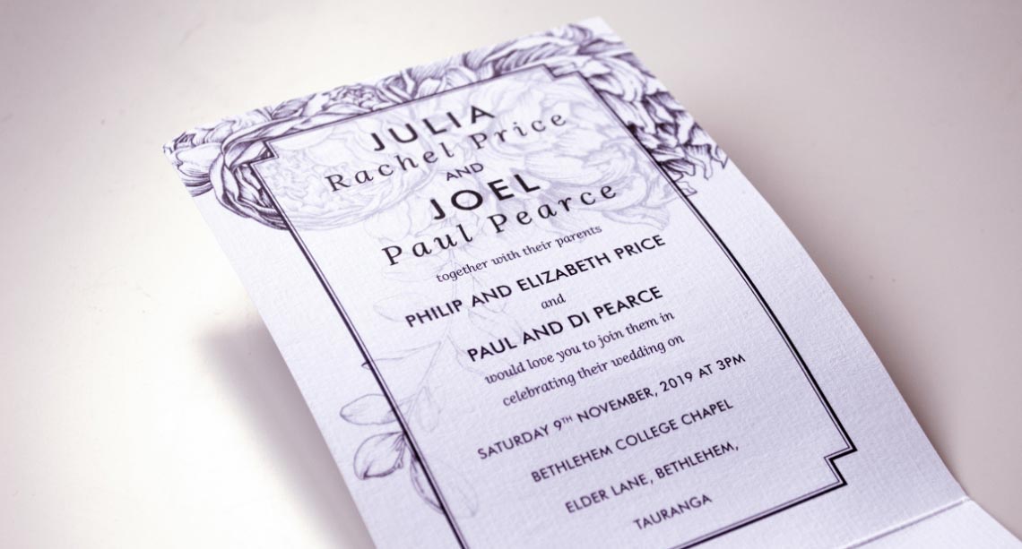
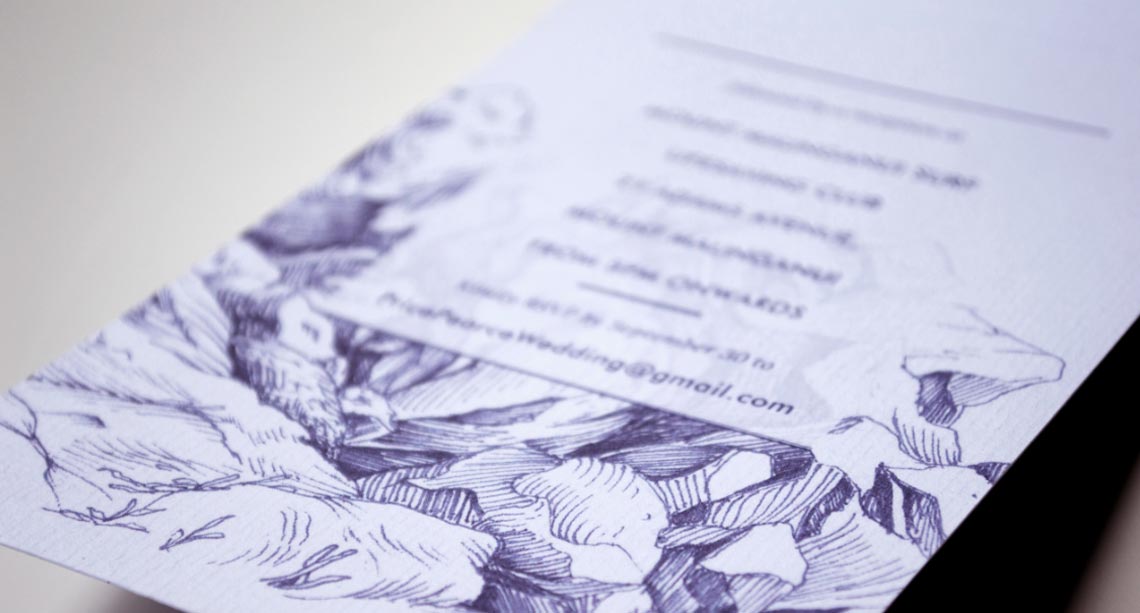
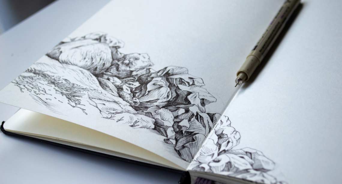
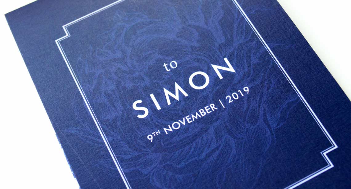
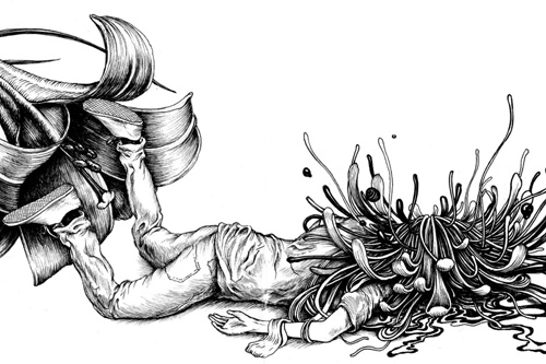
I love being able to add something special to a design by incorporating bespoke illustration. My design for this wedding invite combined tasteful typography with detailed pen and ink illustration, and carefully selected paper stock.
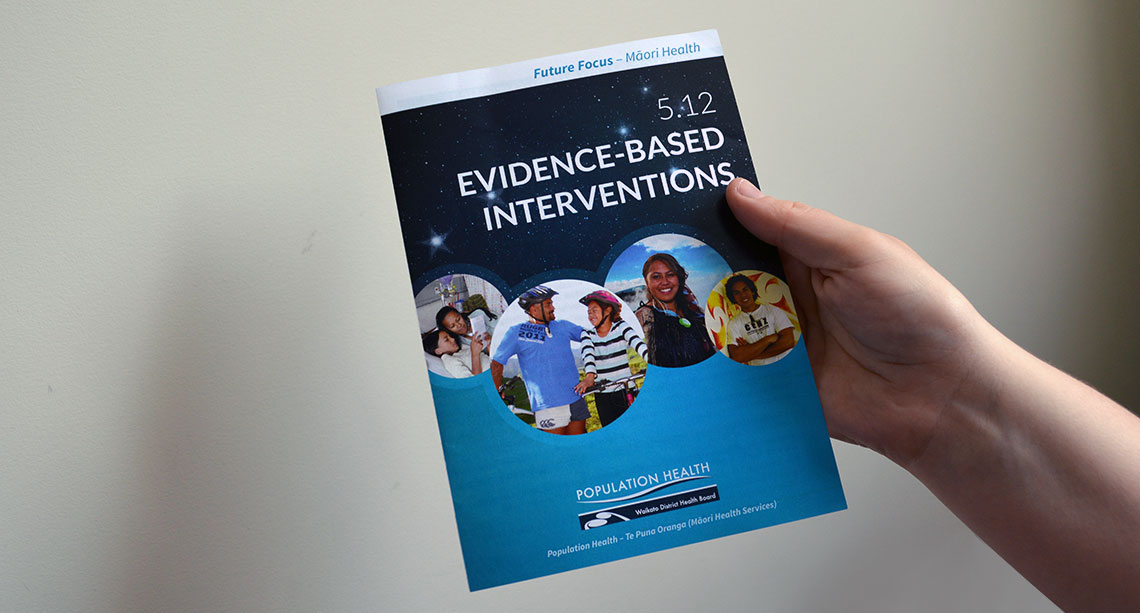
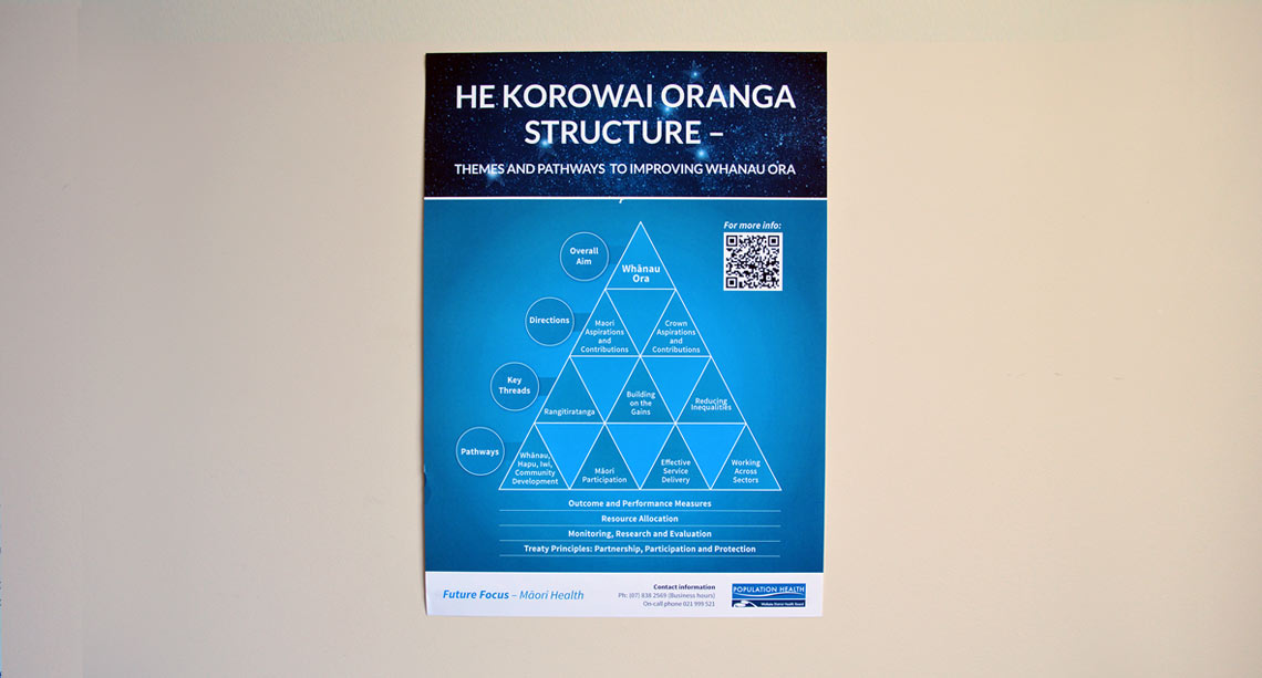
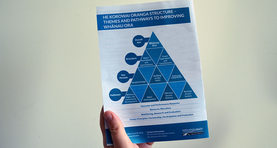
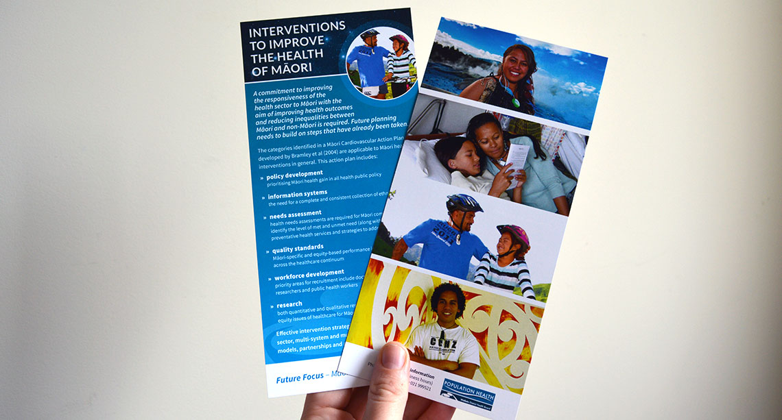
This design was part of a proposal to present the 'Future Focus' research of Population Health in a way that engaged with the community. The colours were derived from the existing Population Health logo. The star constellation used as a background image throughout represents 'Te Pae Mahutonga', which symbolises the Southern Cross as aspects of health promotion.
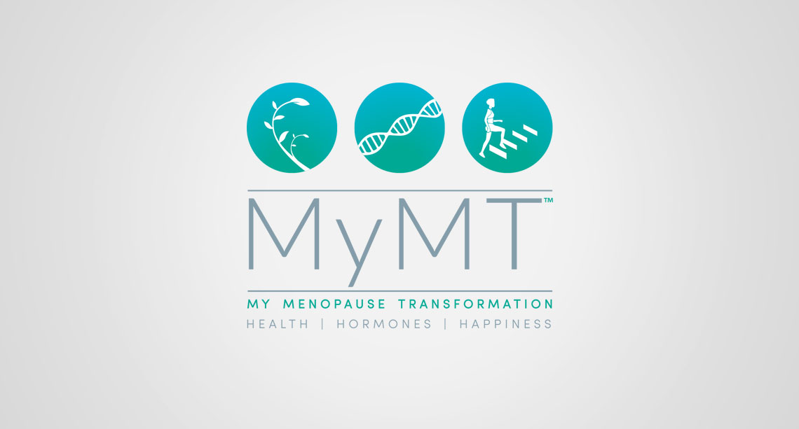
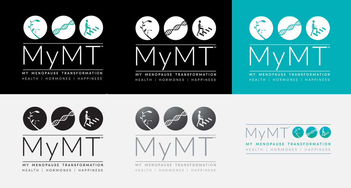
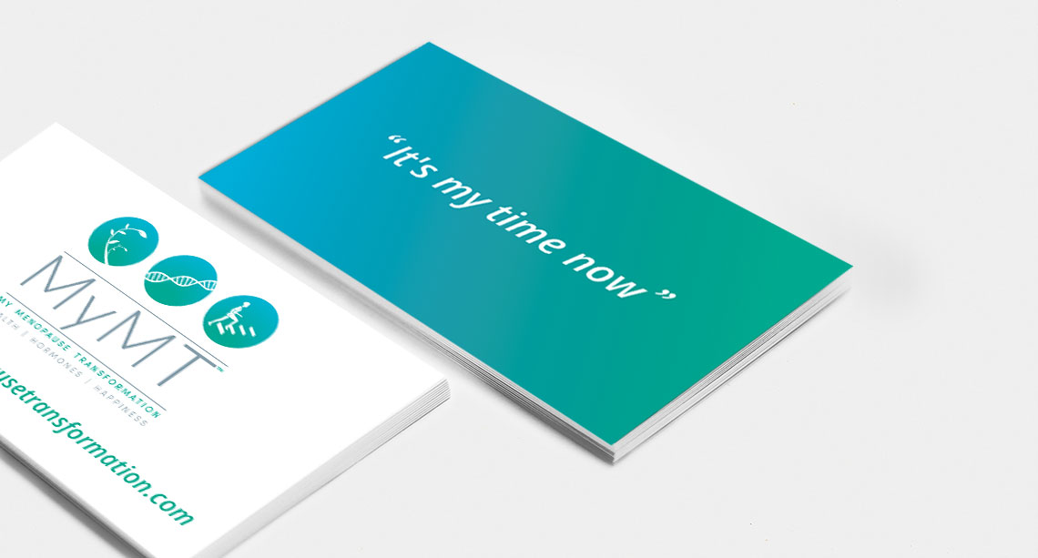
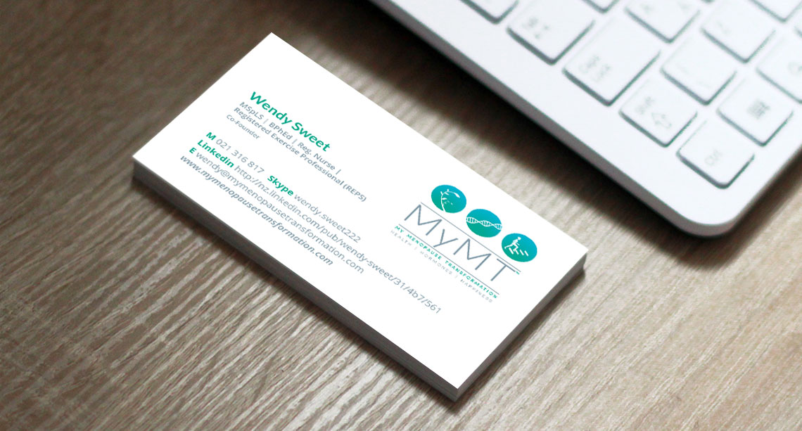
It was a joy creating this logo for Wendy and Gerry from MyMT™ (My Menopause Transformation). MyMT is an holistic programme to transform women's experience of menopause for the better. The three icons in the logo represent the core aspects of the MyMT™ course — Health, Hormones and Happiness respectively.
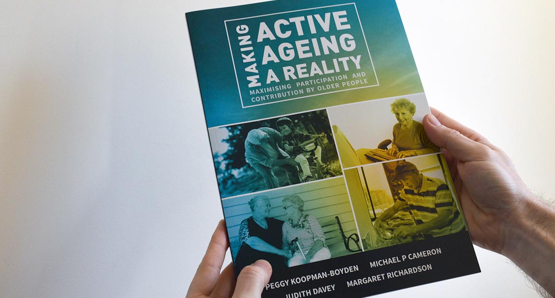
The NIDEA institute undertakes research around population studies and economics to help inform choices and responses to social and economic interactions shaping New Zealand's future. I was asked to create a book cover for research into the increasingly important topic of New Zealand's ageing population, which involved meeting some classic older Kiwi's during my photoshoot!